
The city of Longmont has opened its data collected around things like schools, crime maps and bike routes. I've had an idea for awhile now that I'd like to turn a Madsen cargo bicycle into a mobile version of a little free library. Like an ice cream truck, I would ride the bike through neighborhoods exciting children to borrow interesting books from the mini-library. Longmont is not a particularly large town, but I would put some thought into where I would ride the bike. I'm looking for an efficient way to identify and locate underserved neighborhoods where children may benefit from local access to books. Using the open data available from the city, I can overlay maps of data related to school attendance, graduation rates and household income. I can look at distances from these neighborhoods to local libraries and cross-reference that information with established bike routes. Using all of this information I can draw a strategic route to ride this bibliocycle through town offering books to underserved children. While I have not had the time to pursue this little dream of mine, I was pleasantly surprised to see a program like this already happening with the Boston Public Library. For now, I'll add it to the long list of dream projects that are a few grant applications away from reality.
So, why bring up my bibliocycle idea? It's a human interest story. Who doesn't like the visual of a person riding a brightly colored cargo bicycle through neighborhoods giving books to kids? The piece that makes it relatable is crucial in how we tell the stories that hide in the ever-evolving vast, untapped data streams. This notion applies not only to "Big Data" but to all data as well. Data scientists see stories unfold from numbers and z-scores. They make sense of sample sizes that mere mortals can barely comprehend. This critical layer of analysis sets the foundation for the next equally important piece - the human-relevant story. I would even argue that this subsequent layer might actually be more important. Oddly (to folks like me), most humans don't find data inherently sexy. Even a concise report of findings rarely whets the appetite of your average information consumer. This is precisely where two of my favorite worlds collide - science & communication.
What happens when we deliver the data analysis to storytellers? As defined on Wikipedia, communication (from Latin commūnicāre, meaning "to share") is a purposeful activity of exchanging information and meaning across space and time using various technical or natural means, whichever is available or preferred. The focus on meaning carries particular importance when we're talking about communicating heaps of data into relevant information. Translating columns of numbers and statistical significance into a story takes a specific set of skills. Communication is not simply the stringing together of words. The stronger we build the bridge between science and communication, the better informed our society will become. As the general knowledge base improves so does our ability as global citizens to tackle the present and future challenges we face. On a more personalized level, this improved knowledge empowers people to make informed decisions about issues like healthcare.
Let's consider the hot topic of vaccinations in the United States. There are so many well-written articles from healthcare providers and scientists attempting to lift the veil on the fear and ignorance surrounding vaccination. However, it was a respected storyteller, Roald Dahl, that brought the human element to this debate. Dahl's poignant story about his daughter whom he lost to a particularly dangerous complication of measles is still relevant thirty years later. The image of Dahl's daughter struggling to make animals out of pipe cleaners hours before her passing may be stronger than any statement of statistical significance. However, it is the combination of both elements in his article that makes the story so powerful.
I can take the return of the ironic mom jeans and 1800's beards in stride, but let's be sure that we don't let this hipster nostalgia go too far. When period-specific fashion and diseases start trending together, we've gone too far (in the wrong direction). Nobody likes retro-epidemiology. As a scientist, I want to share my knowledge of immunology and vaccines with others. As a communicator, I want people to engage with the topic and feel comfortable asking questions. Hopping onto a soapbox is a dangerous shortcut. If we want to improve engagement with science and technology, we have to make it approachable. But what does it mean to be approachable? Aesthetics and language play key roles. The burgeoning field of data visualization is a great example where aesthetics and function work in conjunction.
Project Tycho at the University of Pittsburgh aims to "advance the availability of large scale public health data to the worldwide community to accelerate advancements in scientific discovery and technological progress." Access to this kind of "Big Data" will undoubtedly result in amazing discoveries. Again, it's important to remember the second layer of that mission. How will we communicate those discoveries outside of the scientific community? Recently, the Wall Street Journal used Project Tycho data to visualize the dramatic effect of vaccination programs in recent articles on measles in California and the impact of vaccination programs in the 20th century. These visualizations demonstrate that 100 million cases of childhood diseases have been prevented by vaccination programs in the US during the 20th century. An important next step is to take the data and story and sculpt them into public health campaigns. I would argue that the Wall Street Journal is still not the level of approachability for which we should strive.
I am beyond enthusiastic about the movement towards improving citizen access to federally-funded research. In February of 2013, the Office of Science and Technology Policy issued a memorandum (.pdf) to Federal agencies that directs those with more than $100 million in research and development expenditures to develop plans to make the results of federally-funded research publicly available free of charge within 12 months after original publication. This gets to the accessibility aspect but leaves much to be desired in the area of approachability.
Despite being lucky enough to call a research laboratory my home for many years, I never enjoyed reading scientific journal articles. I still don't. I was reminded of that when I spent six weeks on bed rest during the third trimester of my pregnancy reading articles about preeclampsia. I felt fortunate that I had trained long enough to be able to skim and scan those articles and make sense of the agonizingly dry language and muddled figures and charts. But I represent a very small fraction of the population. Even if we make the results of federally-funded research available, who is going to translate all of that information into approachable knowledge for non-scientists? Who is going to sift through all of the data and translate them into actionable knowledge for the public?
I commend my alma mater, University of Florida, for putting forth the resources to address this very issue. The STEM translational communication research (TCR) program was created as part of the UF Preeminence Plan, a $15 million project to bring new talent in areas that can advance UF’s standing as a national leader. Its mission is to "improve human health and well-being by making scientific research more accessible, understandable, and actionable. Properly translated and communicated to various audiences, basic research in science, technology, engineering, math, and health (STEM) can lead to enhanced individual, family, group, and policy-level decision-making." This is an incredibly sophisticated version of what I was attempting to do when I started a Master's in Communication during my doctoral studies in Biomedical Sciences. I wish this structure had existed ten years ago, but I couldn't be happier to see it now.
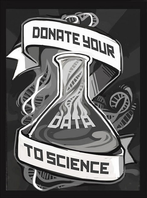
Organizations continue to unlock data for public use and with access to these large datasets comes responsibility. Misrepresentations and misinterpretations could have strong repercussions. Just as computer programming is reemerging as a 21st century critical skill, so too will data analysis and statistical know-how. The fields of data science and visualization are exploding. We need to ensure that there are people who can tell those stories. People who can translate series of numbers into relatable human experiences. People who can transform accessibility into approachability.
Further Reading, Resources & Pretty Data: